What Is Texture in the Elements and Principles of Design (and How Does It Work in Your Home)?
Texture is how a surface looks and feels, whether that’s the soft pile of a wool rug, the cool smoothness of polished marble, or the rough grain of reclaimed wood. In design, it’s the element that adds depth, contrast, and warmth to a space, and it works through touch as much as sight. Texture is also one of the core interior principles that separates a room that looks nice in a photo from one that feels good to stand in.
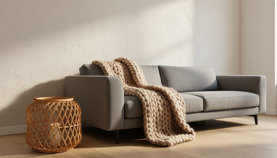
Think of a living room with a flat gray sofa, a flat gray wall, and a flat gray floor. Nothing is wrong with it, yet nothing invites you in either. Swap in a chunky knit throw, a woven basket, and a matte plaster wall, and the same room suddenly has personality.
Below, we’ll cover the main types of texture, how it works in a real room, and a simple DIY project you can finish in an afternoon, plus a smart-home tip for showing off your textures after dark.
Let’s start with what texture actually looks like in practice.
What Texture Means as a Design Element
Texture vs. Pattern vs. Materiality
Texture, pattern, and materiality often show up together, which is why they get mixed up. Picture a woven wool rug. The rug is made of wool (materiality), it has a repeating diamond design (pattern), and it feels nubby and a little rough underfoot (texture). All three live in one object, but each does a different job. If you want a refresher on the basic design principles start there, then come back to see how these three fit in.
- Texture
- How a surface looks and feels, from rough and nubby to sleek and smooth.
- Tactile texture
- Texture you can actually feel with your hands, like bouncy wool or cool marble.
- Visual texture
- Texture that only looks like something, such as wood-look flooring that’s really smooth vinyl.
- Pattern
- A repeated design, like stripes, florals, or a checkerboard.
- Materiality
- The real stuff a surface is made from, such as wood, linen, brick, or glass.
Materiality is the starting point, since the material you pick largely decides the texture you get.
Two Kinds of Texture: Touch It or See It
Texture comes in two flavors, and knowing which one you’re working with makes every material choice easier.
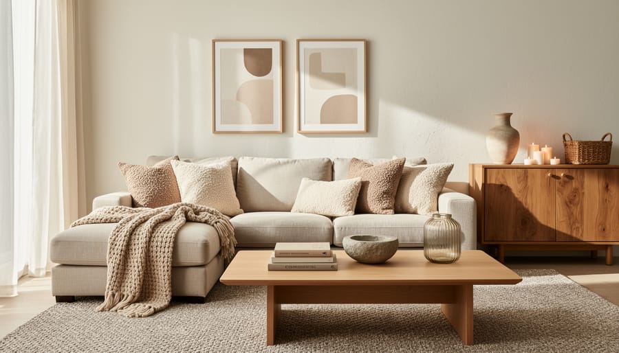
Actual texture is the kind you can feel. Run your hand over a wool throw, a rough plaster wall, or a slab of cool marble, and your fingers pick up the difference right away. Because it physically changes how a surface catches light and casts tiny shadows, actual texture adds real depth. A chunky knit blanket or a stone fireplace brings a room to life in a way a flat painted surface simply can’t.
Visual texture is the illusion. The surface itself may be perfectly smooth, but it looks textured. Think of wallpaper that mimics grasscloth, a printed wood-look floor, or a photo-printed brick backdrop. Your eyes tell you “rough” or “woody” even though your hand finds a flat sheet. Visual texture is a handy, budget-friendly way to get a look you couldn’t otherwise afford or maintain, though it rarely delivers the same warmth as the real thing.
Designers describe both kinds with a handful of simple words:
- Rough: a brick wall or an unfinished wood beam.
- Smooth: a polished countertop or a glass tabletop.
- Soft: a velvet pillow or a plush bedroom rug.
- Glossy: a lacquered cabinet door or a glazed ceramic vase.
- Matte: a chalky wall paint or an unglazed clay planter.
- Nubby: a bouclé chair or a loosely woven linen cushion.
These words are less about fancy vocabulary and more about training your eye. Once you can name how a surface feels or looks, you can start pairing opposites on purpose, like a smooth leather chair next to a nubby wool rug. That contrast is what keeps a space interesting instead of flat.
How Texture Shapes the Feel of a Room
Light, Color, and Texture Working Together
Light and color change the way texture reads. A glossy surface, like lacquered cabinetry or polished marble, bounces light around the room, so it looks brighter and a little cooler. Matte and nubby surfaces, such as boucle, wool, or rough plaster, soak light up instead. They soften shadows and make a space feel cozier.
Color behaves differently from one texture to the next, too. The same navy looks deep and rich on a velvet cushion but crisp and bright on a glazed ceramic vase. A smooth finish shows color evenly, while a rough one breaks it into tiny highs and lows that shift as the light moves through the day.
Putting shiny and soft pieces side by side gives your eye a back-and-forth to follow, a kind of opposition rhythm that keeps even a single-color room from feeling flat.
Where Texture Shows Up: Putting It to Work in Your Space
Texture shows up everywhere in a space, and the easiest way to put it to work is to walk through the surfaces you already have.
Start with the walls and ceilings. Limewash, textured plaster, grasscloth, wood paneling, or even a simple roller finish can turn a flat backdrop into something with depth. Don’t forget the ceiling: wood slats or a subtle plaster finish give a room a finished, intentional feel, especially in offices and restaurants.
Flooring and rugs come next. Hardwood, tile, and polished concrete set the base, while a chunky wool or jute rug adds softness underfoot. Layering a smaller textured rug over a larger flat one is a quick way to add dimension without a renovation.
Furniture upholstery is where texture gets personal. Bouclé, linen, velvet, and leather all feel and look different, so mixing two or three on a single seating area keeps it interesting. Pair a smooth leather chair with a nubby wool throw and you’ve got contrast with almost no effort.
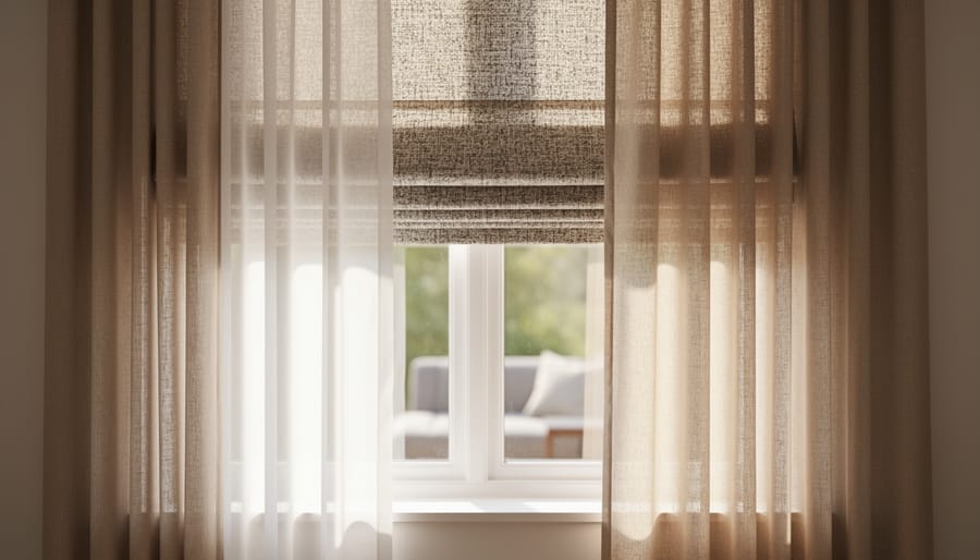
Window treatments soften hard edges. Woven shades, linen drapes, and sheer panels filter light differently and add a layer of fabric that plain blinds can’t match. Lighting and accessories finish the job. Ceramic lamps with a hand-thrown glaze, rattan pendants, woven baskets, and carved wood bowls are small pieces that carry a lot of tactile interest.
Tech tip: Lighting changes how texture reads, so try smart dimmable bulbs with adjustable warmth. A warm, low-angle glow makes plaster, brick, and woven fabric pop, while harsh overhead light flattens them. Before you buy anything big, a room-visualizer app lets you preview swaps like a new wall finish or rug, so you can test combinations without committing.
Whether you’re styling a living room or a retail space, you don’t need to change everything. Pick two or three of these spots and add contrast between them.
DIY: Add Texture to a Room in a Weekend
Here’s a beginner-friendly project that puts texture to work without any construction: layering a bed or sofa. It takes about two to three hours, so it fits easily into one afternoon.
What you’ll need:
– A base layer, like a smooth cotton or linen duvet cover or throw
– A chunky knit or wool blanket
– Two or three pillows in different fabrics, such as velvet, boucle, and woven cotton
– A faux fur or sheepskin throw (optional)
– A natural-fiber basket or wooden tray for a hard-surface accent
Step 1: Start with a calm base. Strip the bed or sofa down and set your smooth base layer first. This gives your other textures something quiet to stand out against.
Step 2: Add one heavy layer. Fold the chunky knit or wool blanket in thirds and lay it across the foot of the bed or over one sofa arm. This is your main tactile anchor.
Step 3: Mix pillow textures. Pick pillows that feel different from each other, not just look different. Pair something plush, like velvet, with something nubby, like boucle, and something flat and woven. Odd numbers usually look best, so try three or five.
Step 4: Vary the scale. Combine a large, bulky texture with a fine, tight one so the layers don’t compete. A thick knit beside smooth linen reads as deliberate rather than busy.
Step 5: Bring in a contrast. Set a wooden tray or woven basket nearby. A hard, matte surface makes the soft fabrics feel even cozier.
Step 6: Step back and adjust. Take a look from the doorway and squeeze each pillow to check the feel. If anything looks cluttered, remove one item. Aim for at least three distinct textures, then stop.
Common Texture Questions
Texture questions tend to come up the same way, so here are the ones I hear most. Each answer is short enough to act on today.
How much texture is too much?
If a room feels busy or you can’t tell where to look first, you’ve likely gone too far. Aim for about three different textures, then let one quiet, smooth surface give the eye a place to rest.
How do I add texture to a small room?
Keep the pieces small and the palette tight. A chunky knit throw, a woven basket, and a linen curtain add depth without crowding the floor, and sticking to similar colors keeps the space calm.
Can I mix textures with patterns?
Absolutely. Let the textures carry most of the work and choose one or two patterns in the same color family, so the patterns feel like part of the layering instead of competing with it.
Does texture matter in a minimalist space?
It matters more there, because fewer objects mean each surface does more of the work. Subtle minimalist texture like plaster walls, a wool rug, or a matte ceramic lamp, keeps a clean room from feeling cold.
If you’re ever unsure, start with one change and live with it for a few days. Add a single new texture, notice how the room feels, and build from there. Texture is easy to layer in and just as easy to pull back, so you can experiment without much risk.
Texture is the layer that makes a room feel finished. It’s what turns a tidy space into one you actually want to sink into, and it quietly supports everything else you’ve chosen, from color to layout to lighting. Whether you’re working with a rough plaster wall, a nubby wool throw, or a glossy ceramic lamp, the principle is the same: contrast and variety give a space depth.
Texture also doesn’t work alone. It sits alongside pattern and materiality as part of the Core Interior Principles, and the strongest rooms balance all three. Texture is how a surface feels, pattern is how it repeats, and materiality is what it’s really made of.
You don’t need a full redesign to put this into practice. Start small this week. Add one new texture to a room, maybe a chunky knit pillow, a woven basket, or a linen curtain, and notice how the space shifts. When you’re ready for more, explore the Accent Interiors guides on pattern and materiality to keep building your eye.