Opposition Rhythm: The Design Secret That Makes Boring Rooms Feel Alive
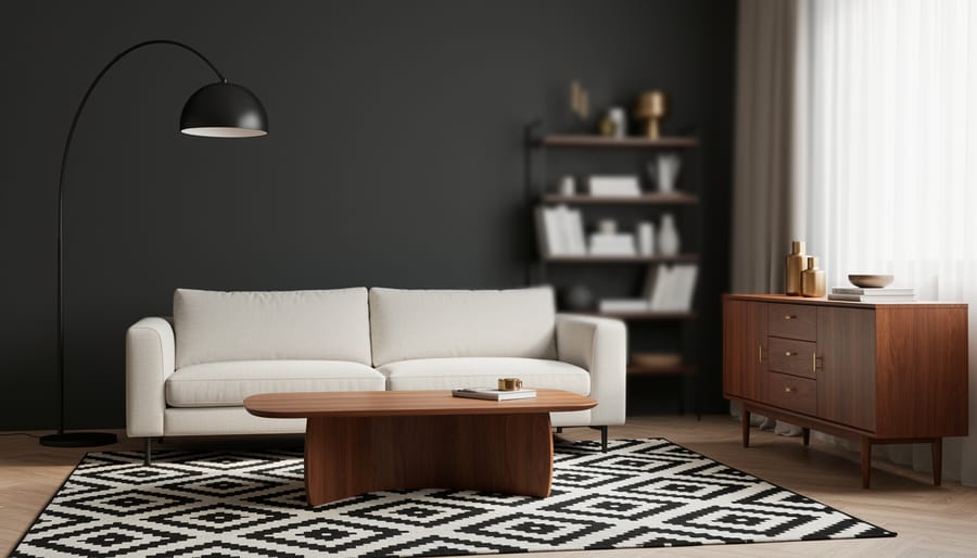
Create visual tension in your rooms by pairing contrasting elements that energize your space. Opposition rhythm, one of the fundamental design principles, brings balance through deliberate contrast—think dark walls with light furniture, geometric patterns beside organic shapes, or modern pieces mixed with vintage finds. This technique works because our brains naturally seek patterns and find satisfaction when contrasting elements create visual dialogue rather than chaos.
Unlike repetitive rhythm that relies on consistent elements, opposition rhythm thrives on purposeful differences that still maintain overall harmony. When executed correctly, it transforms flat, predictable rooms into dynamic spaces that hold attention and feel professionally curated. The key lies in choosing opposing elements that complement rather than clash—creating enough contrast to generate energy while maintaining a cohesive look.
Whether you’re refreshing a single room or redesigning your entire home, understanding opposition rhythm gives you the confidence to mix styles, textures, and colors intentionally. You’ll discover why some eclectic spaces feel perfectly balanced while others feel disjointed, and learn exactly how to achieve that magazine-worthy look in your own space.
What Opposition Rhythm Actually Means (And Why It Matters)
Opposition rhythm is one of those design concepts that sounds complicated but is actually quite simple once you break it down. At its core, opposition rhythm is the intentional pairing of contrasting elements to create visual energy and movement in a room. Think of it as controlled tension—like a visual conversation between opposing forces that keeps your eye moving and engaged.
Unlike other types of rhythm in interior design, opposition specifically thrives on contrast. Repetition rhythm, for instance, relies on repeating the same element throughout a space—like evenly spaced artwork along a hallway. Progression rhythm creates a gradual shift, such as pillows arranged from smallest to largest. Transition rhythm guides your eye smoothly through curves and flowing lines. But opposition rhythm? It’s all about the dynamic push and pull between opposites.
This is where things get exciting. Opposition rhythm might pair rough textures with smooth surfaces, dark colors against light backgrounds, or angular furniture alongside curved accents. The magic happens when these contrasting elements don’t fight each other but instead create a balanced tension that makes a space feel alive and interesting.
Why does this matter for your home? Rooms designed with opposition rhythm avoid the trap of being either too boring or too chaotic. They have personality and visual interest without overwhelming the senses. When you understand this principle alongside other professional design techniques, you gain the power to create spaces that feel intentionally curated rather than randomly decorated. The result is a room that naturally draws people in and keeps them engaged, even if they can’t quite articulate why it feels so right.

The Psychology Behind Why Opposition Rhythm Works
Our brains are hardwired to notice differences. When you walk into a room where everything is perfectly matched—same colors, same textures, same shapes—your eyes have nowhere interesting to land. It’s like listening to a single note played continuously. Within seconds, your brain tunes it out.
Opposition rhythm works because it creates what psychologists call “visual tension,” and here’s the surprising part: that’s exactly what makes a space feel alive. Think about your favorite song. It’s not just one steady beat, right? It’s the interplay between high notes and low notes, loud and soft, fast and slow that keeps you listening.
The same principle applies to your living room. When you pair a sleek modern coffee table with a plush, textured sofa, your brain gets engaged. It notices the contrast, processes the relationship between the two elements, and finds satisfaction in how they complement each other despite being opposites.
This controlled tension is the key phrase here. Too much opposition—mixing every possible style, color, and texture—creates chaos that exhausts the eye. But strategic contrast gives your brain just enough stimulation to stay interested without becoming overwhelmed.
Studies show that spaces with intentional contrast improve mood and reduce visual fatigue. When you design with opposition rhythm, you’re essentially creating a conversation between different elements. Your eyes move naturally from one contrasting feature to another, exploring the space rather than glazing over it. That movement, that gentle visual journey, is what transforms a room from simply furnished to genuinely engaging.
Common Opposition Pairs That Transform Spaces
Light vs. Dark
Value contrast—the difference between light and dark elements—creates visual interest without overwhelming your space. The key is balancing these opposing tones thoughtfully throughout the room rather than concentrating them in one area.
Start with a dominant value for your walls and larger furniture pieces, then introduce the opposing value through accent pieces. For example, pair a light sofa with dark throw pillows, or place a dark wooden coffee table against a cream-colored rug. This creates rhythm while maintaining harmony.
Consider the 60-30-10 rule: use your main value for 60% of the room, the contrasting value for 30%, and a bridging mid-tone for the remaining 10%. This prevents stark divisions that can feel jarring.
Finishes offer subtle opportunities for value play. Matte dark fixtures against glossy light tiles, or weathered wood shelving on crisp white walls add depth without drama. Pay attention to natural light patterns too—darker elements gain dimension when positioned where sunlight can graze them, softening the overall contrast and creating a more cohesive, dynamic space.
Rough vs. Smooth
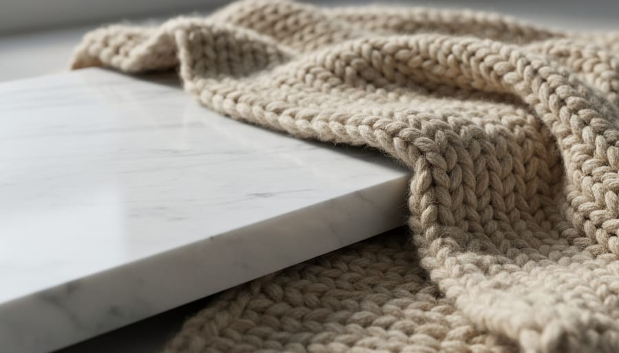
Texture creates one of the most satisfying contrasts in interior design. Think about running your hand across a sleek leather sofa, then reaching for a chunky knit throw draped over the arm. That tactile difference is what makes a space interesting and inviting.
Pairing smooth surfaces with rough ones adds instant depth to any room. Try placing a glossy ceramic vase on a raw wood coffee table, or layer a silky velvet cushion against nubby linen upholstery. In bathrooms, polished marble countertops gain character when paired with textured stone tiles or woven baskets.
The key is balance. If everything feels smooth and polished, your room might seem cold or sterile. Too much rough texture can feel overwhelming. Aim for a 60-40 split, letting one texture dominate while the other provides contrast.
Start small with accessible DIY touches: add a jute rug under your glass dining table, or display smooth river rocks in a rustic wooden bowl. These simple pairings create visual interest without requiring a complete room makeover.
Large vs. Small
Playing with scale creates instant visual interest and prevents your space from feeling monotonous. The key is deliberately pairing large and small elements throughout the room to guide the eye on an engaging journey.
Start with furniture as your foundation. A substantial sectional sofa paired with a delicate side table creates immediate contrast. Think oversized statement pieces balanced by petite accent furniture. This doesn’t mean random sizing, it means intentional opposition that feels cohesive.
Pattern scales work similarly. Mix large-scale geometric prints on throw pillows with smaller, detailed patterns on curtains or area rugs. The varying scales create depth without overwhelming the senses.
Decorative objects offer the easiest entry point for beginners. Group a tall floor vase beside short ceramic pieces on a console table. Hang one large piece of artwork alongside a gallery wall of smaller frames. Layer chunky woven baskets next to dainty trinket boxes on open shelving.
The secret is maintaining proportion within each pairing. Too extreme, and it looks accidental. Just enough contrast, and you’ve created purposeful rhythm that makes your room feel professionally designed and naturally dynamic.
Straight vs. Curved
Sharp angles meeting soft curves creates instant visual interest that keeps your eye moving around a room. Think of pairing a geometric angular sofa with rounded ottomans, or placing a circular mirror above a rectangular console table. This contrast feels natural because it mirrors what we see in the world around us—rigid tree trunks supporting flowing leaves, or structured buildings framed by billowing clouds.
Try incorporating flowing curtains or draped fabrics alongside straight-edged furniture pieces. A glass coffee table with clean lines looks stunning when paired with organic-shaped decorative bowls or sculptural vases. Even your architectural elements can participate—rectangular windows gain warmth when dressed with curved valances or arched floor lamps positioned nearby.
For a simple DIY approach, start small by adding curved throw pillows to your linear couch, or place a round tray on your square coffee table. These gentle introductions to straight-versus-curved opposition create rhythm without overwhelming your existing décor, making any space feel more thoughtfully designed and professionally curated.
How to Apply Opposition Rhythm in Your Home (Room by Room)
Living Rooms
Your living room is the perfect canvas for practicing opposition rhythm. Start with a sleek, low-profile modern sofa in a solid neutral color, then introduce contrast by placing a chunky rustic wood coffee table in front of it. The smooth upholstery plays beautifully against the natural grain and texture of weathered wood.
Add a geometric rug with sharp angles and repeated patterns beneath your seating area, then soften the space with curved accent chairs featuring rounded backs and arms. This creates visual conversation between straight and flowing lines that keeps your eye moving around the room.
Consider pairing a minimalist metal floor lamp with an ornate vintage side table, or hang contemporary abstract art above a traditional brick fireplace. The key is balancing each bold choice with its opposite—smooth with rough, angular with curved, modern with vintage. These deliberate contrasts create energy and prevent your living room from feeling too matchy or one-dimensional, making it a space that genuinely reflects personality while maintaining visual interest.
Bedrooms
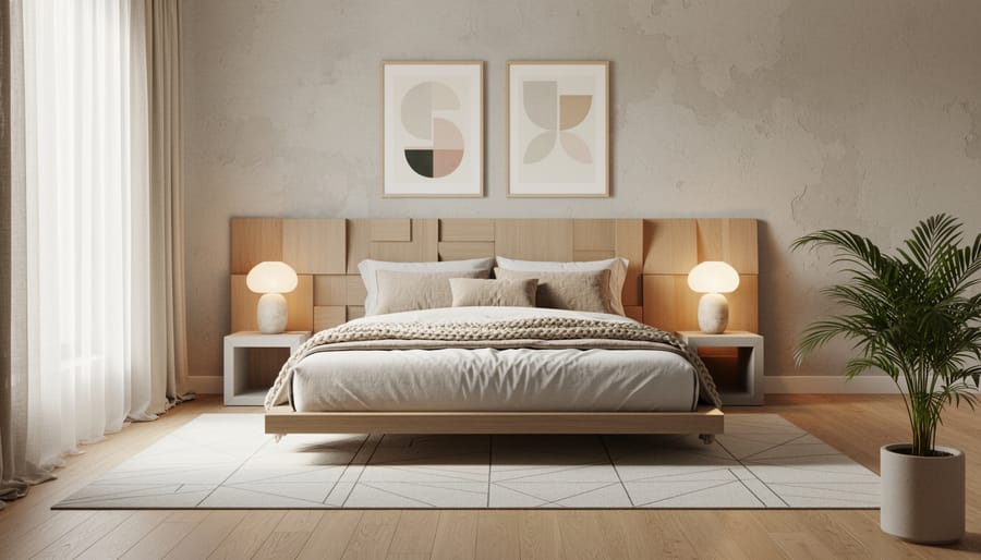
Your bedroom should feel like a sanctuary, but that doesn’t mean it has to be boring. Opposition rhythm creates the perfect balance between calm and visual interest. Start with your bed as the focal point by pairing soft textures like plush velvet or linen bedding against a structured leather or tufted headboard. The contrast between fluid fabrics and rigid architectural elements keeps the eye engaged without disrupting relaxation.
Try mixing matte painted walls with glossy nightstands, or place rough natural wood furniture against smooth painted surfaces. For a simple DIY approach, layer organic curved elements like rounded mirrors or arched wall decor opposite your room’s sharp rectangular windows and door frames. You can also create opposition through lighting by combining a dramatic angular pendant light with soft, rounded table lamps. The key is maintaining enough contrast to energize the space while keeping the overall palette cohesive and restful.
Kitchens and Dining Areas
Kitchens and dining areas offer perfect opportunities to experiment with opposition rhythm since they naturally combine different materials and purposes. Start with material contrasts by pairing matte-finish cabinets with a glossy tile backsplash. This creates visual interest without overwhelming the space, as the smooth reflection bounces light while the flat cabinet fronts provide calm stability.
For style opposition, try mixing industrial pendant lighting over a traditional farmhouse dining table. The raw metal and exposed bulbs create an unexpected dialogue with the warm, classic wood below. This technique works particularly well in open-concept spaces where the kitchen flows into the dining area.
Another effective approach combines modern bar stools with vintage-inspired kitchen islands, or sleek stainless steel appliances against rustic wood shelving. The key is maintaining balance—choose one dominant style and introduce contrasting elements as accents rather than competing focal points.
For a DIY-friendly project, swap out standard cabinet hardware for pieces that contrast your cabinet style. Modern brass pulls on shaker-style cabinets or minimalist handles on ornate cabinetry instantly creates that rhythmic opposition while remaining budget-conscious and easily reversible.
The Biggest Mistakes People Make With Opposition Rhythm
Even experienced designers stumble when working with opposition rhythm. The most common mistake? Going overboard with contrast. When every element fights for attention—mixing multiple bold patterns, clashing colors, and contrasting textures all at once—you’ll create visual chaos rather than dynamic energy. Your room should feel exciting, not exhausting.
On the flip side, playing it too safe produces equally disappointing results. If your oppositions are too subtle or timid, you’ll end up with a bland space that lacks personality. Pairing cream with off-white or placing similar-sized objects together won’t create the tension that makes opposition rhythm work.
Another frequent pitfall is forgetting the glue that holds everything together. Without a unifying element—whether it’s a consistent color palette, repeated material, or shared style—your contrasts will feel random and disjointed. Think of it this way: opposition rhythm needs an anchor. If you’re mixing modern and vintage pieces, perhaps they all share similar wood tones. If you’re combining bold patterns, they might pull from the same color family.
The key to success lies in balancing contrast with cohesion. Start with one strong opposition and build gradually. Step back frequently to assess whether your room feels intentionally dynamic or accidentally chaotic. Remember, opposition rhythm should guide the eye through your space in an interesting journey, not create a confusing maze.
Quick DIY Project: Create Opposition Rhythm in One Afternoon
Ready to see opposition rhythm in action? Let’s transform your coffee table this afternoon using items you already have.
Start by clearing your coffee table completely. Now, gather a variety of decorative objects from around your home: books, candles, small plants, bowls, picture frames, or sculptures. Here’s where the magic happens.
First, identify contrasting pairs. Look for height differences like a tall vase next to a stack of low-profile books. Mix textures by placing a smooth ceramic bowl beside a rough woven basket. Combine geometric shapes with organic ones, perhaps a square tray alongside a round candle.
Begin arranging with the largest or tallest item first, positioning it slightly off-center. Add your contrasting element nearby, creating that essential push-pull dynamic. Continue building with smaller items, always thinking in opposites: light next to dark, shiny beside matte, empty space balanced against clustered items.
Use this quick checklist to spot opposition opportunities:
Are there both vertical and horizontal elements?
Do I see light and dark colors working together?
Am I mixing smooth and textured surfaces?
Are organic shapes paired with geometric ones?
Does the arrangement include both filled and empty spaces?
Step back frequently to assess the visual tension. You should feel your eye moving naturally around the display rather than settling in one spot. If something feels static, swap in a contrasting element. This simple project typically takes 30-45 minutes and instantly demonstrates how opposition rhythm creates visual interest.
Opposition rhythm isn’t about creating chaos—it’s about intentional contrast that breathes life into your spaces. When you thoughtfully pair opposites, you’re giving rooms a visual heartbeat that keeps the eye moving and the mind engaged. The difference between a flat, forgettable room and one that feels alive often comes down to these strategic contrasts.
Take a fresh look at your current spaces. Where could you introduce opposition to shake things up? Maybe your bedroom needs a chunky knit throw against those sleek modern nightstands, or your living room could benefit from geometric pillows on a curved sofa. The opportunities are everywhere once you start looking.
Here’s the empowering truth: there’s no single “right” way to pair opposites. Trust your instincts. If a combination excites you, chances are it will create the dynamic energy you’re after. Start small with accessories or textiles—these low-commitment changes let you experiment without overthinking. The beauty of opposition rhythm is that it celebrates contrast rather than hiding from it, turning potential clashes into compelling conversations between design elements that make your space uniquely yours.